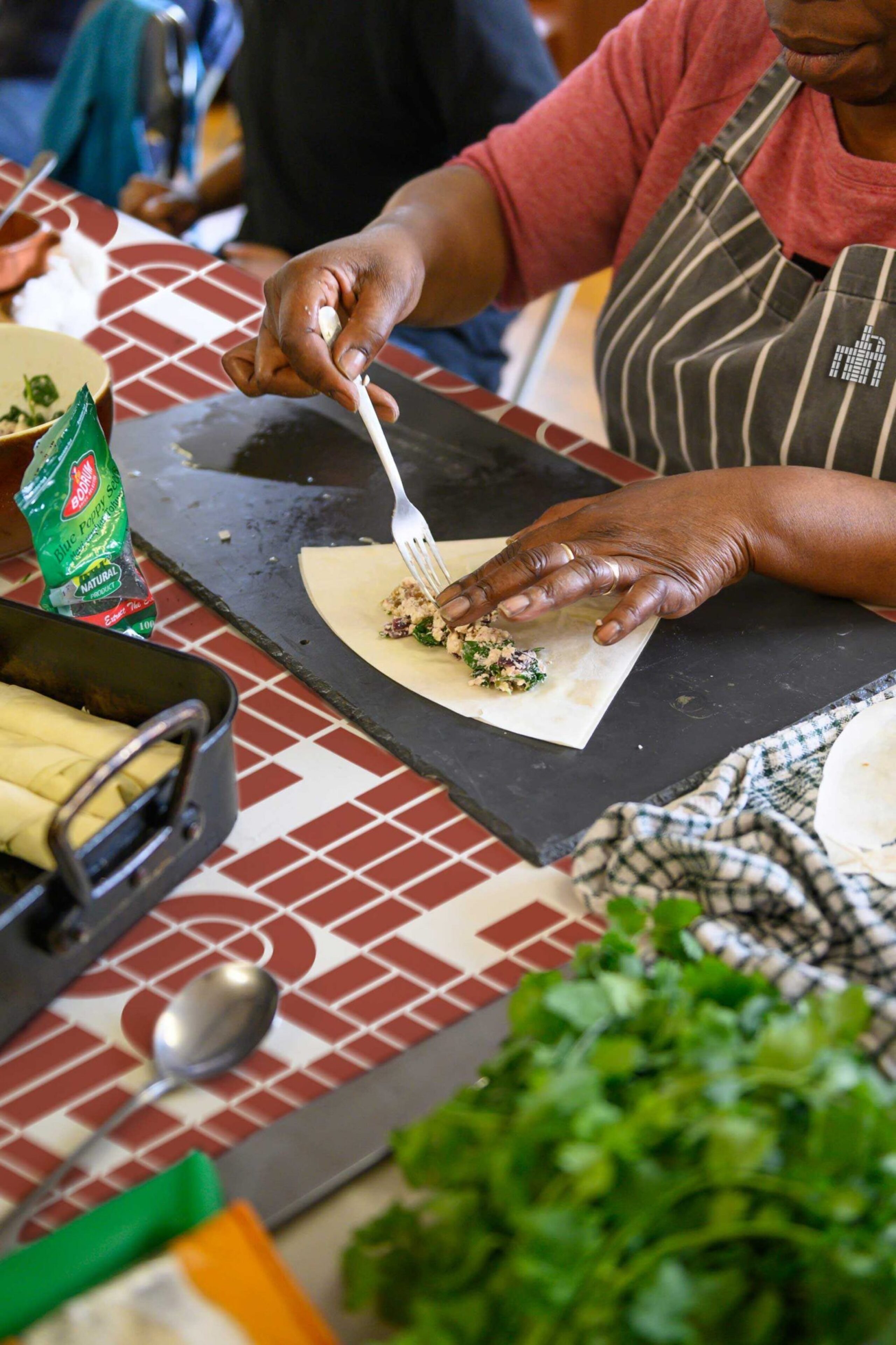
Silvertown is an East London neighbourhood
bristling with an exhilarating vision that will
transform it into an enterprising new town
centre for the Royal Docks
Inspired by its proud industrial heritage,
we repositioned Silvertown as an iconic
destination neighbourhood seeking to
reinvent the capital’s relationship with
the waterside
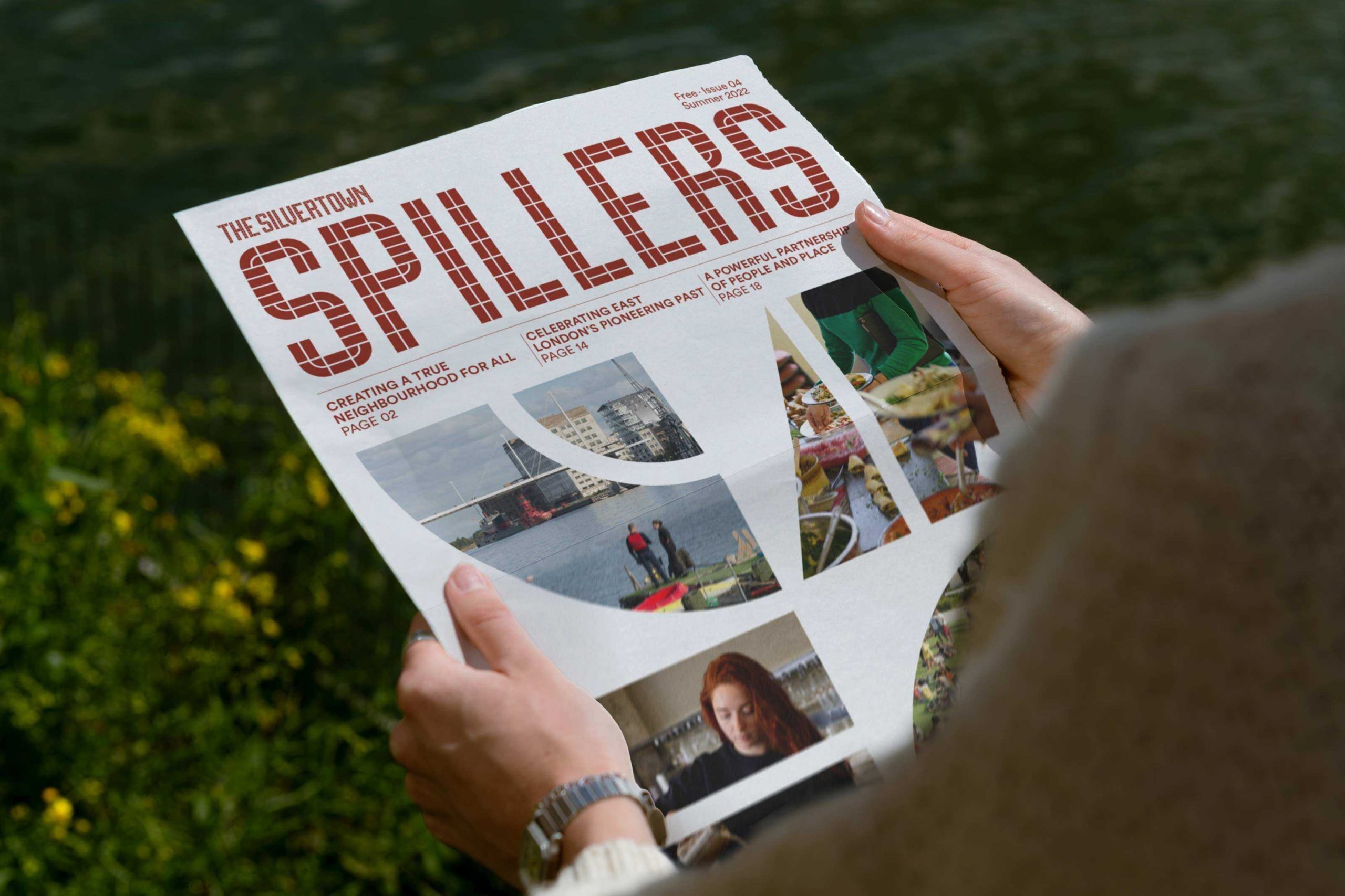
Building a brand out of place
Global developer Lendlease wanted to make Silvertown an authentic home, commercial hub and a meeting place for people from all over the capital who were now within Silvertown’s catchment thanks to the Elizabeth Line.
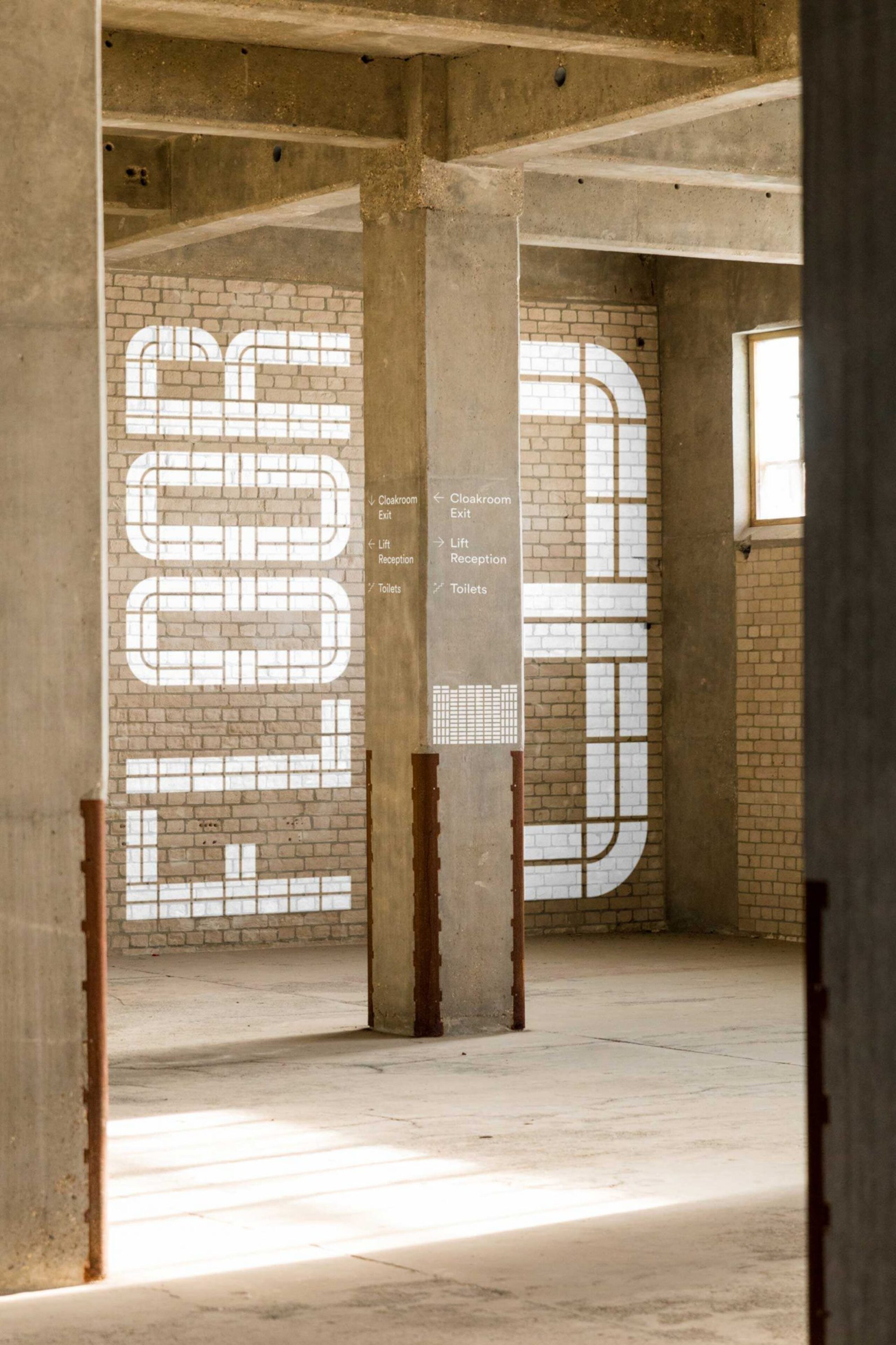
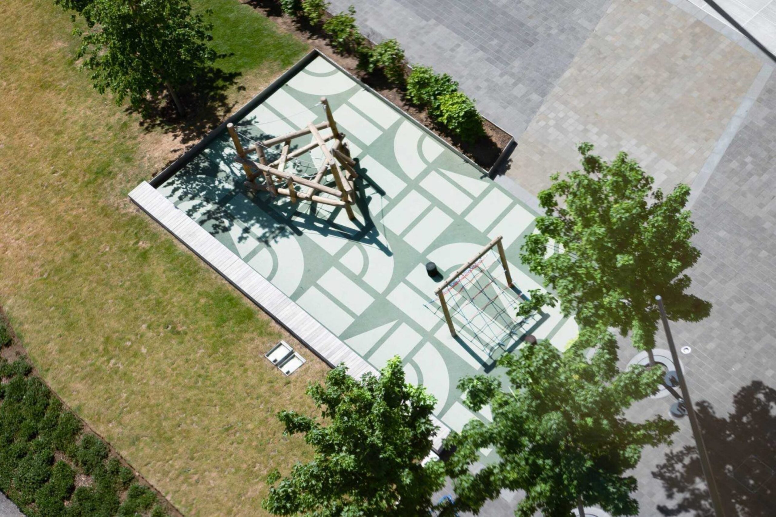
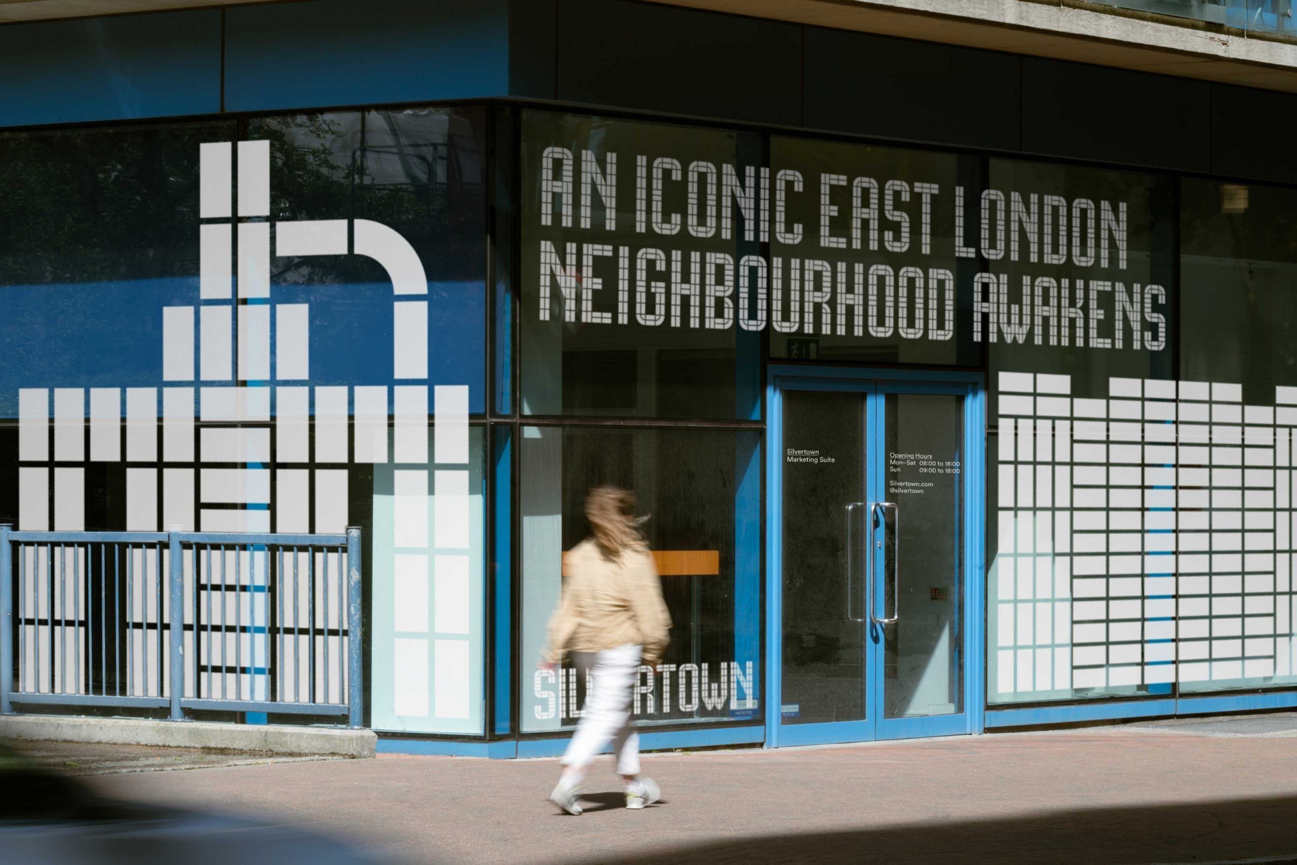
Like a mosaic, we created a series of modules from the lettering of one of Silvertown’s most iconic buildings, Millennium Mills. We used these graphical elements to create a bespoke typeface, animate mesmerising patterns and build supergraphics that could hold vibrant photography. It was a simple yet powerfully effective way of threading Silvertown’s industrial character throughout the whole brand.

Recognising an icon
Drawing on the character of Silvertown itself — its architecture, heritage and proud communities — we created a messaging toolkit fronted by a bold new strapline that captured a sense of unstoppable forward momentum while reintroducing Silvertown to the world: ‘An iconic East London neighbourhood awakens’.

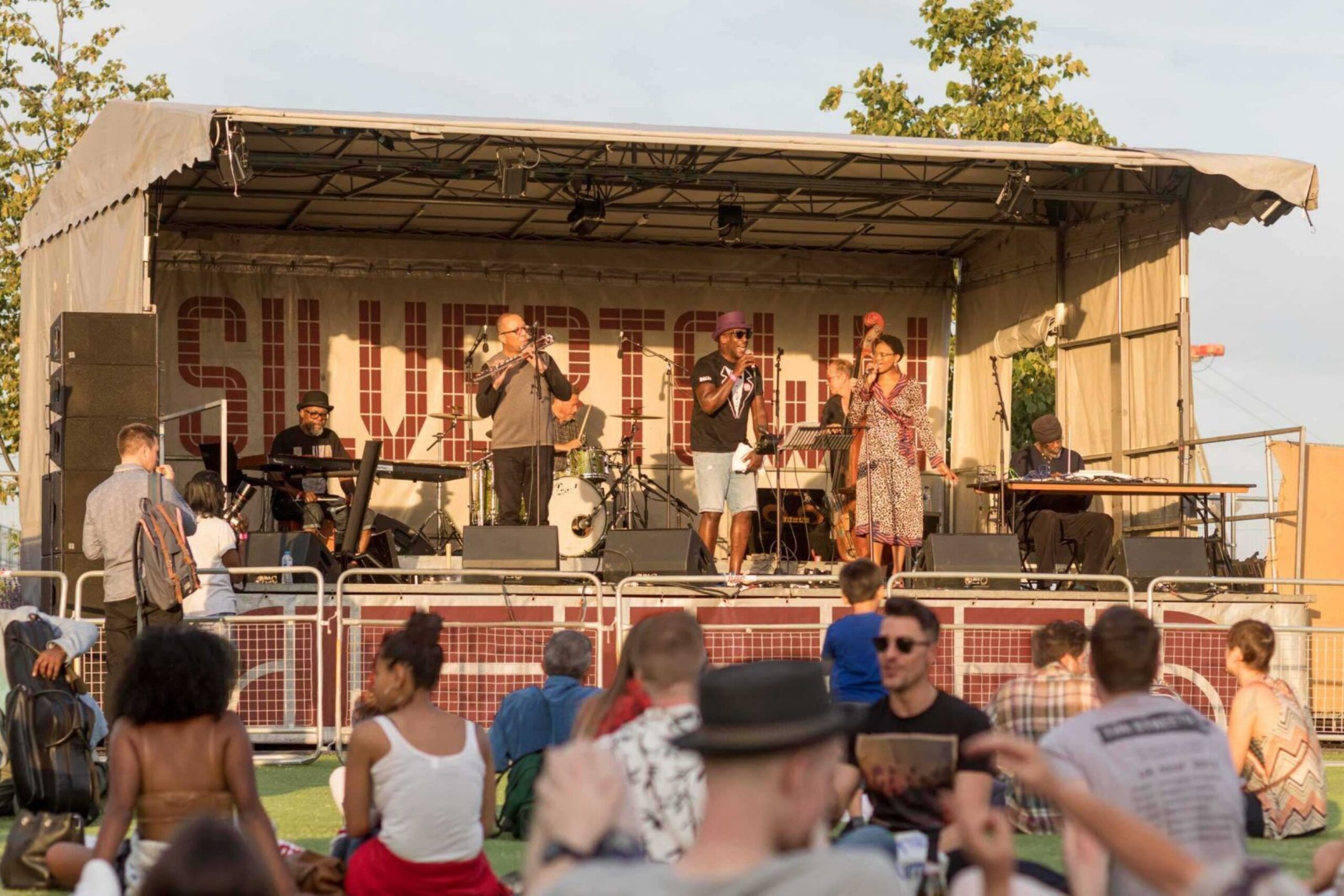
A future brighter than ever
Our new brand and messaging cast Silvertown as a hero of the wider Royal Docks story while harnessing the power of the Elizabeth Line, water and industrial legacy to pin it firmly onto London’s mental map.
Silvertown will soon awaken as somewhere to power next-generation business, experience with friends and find a new home. A beacon of enterprise and enjoyment where all of London — from East to West — belongs.